Project ISC8
ISC8 evolved from Irvine Sensors Corporation, a private R&D firm used by the U.S. government for national security. Their focus now is to deliver the most comprehensive cyber-security solutions available, offering security products designed to solve the toughest challenges including the human or 8th layer, a problem that until now has gone unaddressed.
Brand development
We begin every branding project with the same goal: to clarify the client’s message, simplify their image, and unify all their marketing components together in one cohesive package. A brand is more than an identity or a logo: it is the personality behind the name that identifies a product, service or company and how it relates to and is experienced by customers, staff, partners, investors etc. All components of a brand should “speak with one voice” to create a clear focused message. To do this successfully, we create the identity while keeping all the future components in mind to ensure they will work as an integral part of the brand.
Identity Development
The identity is the “face” of the company and should express the core of ISC8’s personality: high-tech, cutting edge, proactive, responsive, intelligent, visionary, comprehensive, secure, and reliable.
Type
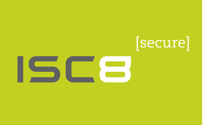
ISC8’s identity will not contain a symbol or “mark” along with the name. Instead, we will set the name in a custom-designed typeface, adapted from an existing face. We begin by researching type online at a font bank, selecting styles that will work with the company’s personality. We choose from a group of san serif typefaces which naturally lend themselves to a high-tech feel, and then further refine the list based upon the shapes of the characters and the way they interact with one another. We settle on 4 final choices, and then begin to sketch modifications to the letterforms to make them distinctive and protectable.
Tagline
At the same time we are working on developing the type, we are thinking about what could work as a tagline to clarify the client’s message. After going over our notes from creative sessions with Senior VP of Business Development, Joy Randels, and freelance copywriter David Chesnick, we settled upon one word rather than a phrase that best represented the mission of the company: secure. We wanted the word to interact with the identity, but not overpower it. We played with placement, and then put the word in brackets to visually set it apart from the company name as well as to make it secure in the bracket frame. This worked well and provided a design element as well as a conceptual element we could use with other marketing components: we could place other words in the brackets to define content while referring back to the identity. The final step was to relate the identity to the tag. Our solution was to modify the top of the “8” to create a pointer to the tag which also made it stand out from ISC and gave us yet another distinctive design element to work with.
Color
Color helps to set a mood and further define a brand’s image, makes various elements loud or soft, adds tension or harmony, etc. In this project, the color choice needed to be serious, professional, a little edgy, and easy to reproduce in a variety of applications, from business cards to buildings, products to advertising. We looked through color books and played with combinations until we settled on a cool palette of dark gray and yellow-green: cool is cerebral, calm, technical; dark gray works well for legibility and is a bit unexpected over the typical black; the yellow-green is eye-catching and fresh, a pop of color to contrast the gray and separate the 8 and the tag from the ISC.
Client Review
We present the client with a few variations on the design we feel is our best. We find this “best foot forward” approach keeps a multi-component branding project moving forward in a timely fashion, saves the client from wading through an overwhelming number of choices and reviews, and makes the budget more manageable. At the review, the client gives feedback, we make a few tweaks and we are ready to move forward with the website and collateral materials.

