At the end of March, Tom Aposporos, President of the Longboat Key Chamber, approached us about designing a new website for the LbK Chamber and LbK, Lido Key, and St. Armands Key Visitor Center. A classic visionary, Tom wanted to create something revolutionary and challenged us to re-think every aspect of the site, from the homepage to member listings, advertising to visitor information. A week later we met with Tom and Dawn Mims, LbK Executive Vice President, to discuss the project in detail. Tom’s enthusiasm was infectious, his ideas bubbled over, and we couldn’t take notes fast enough. By the end of the meeting, we had agreed to not only transform the website, but the entire brand of the Longboat Key Chamber as well. Then he dropped the bomb – the launch date must be July 1st. That leaves only 2 months to start a revolution!
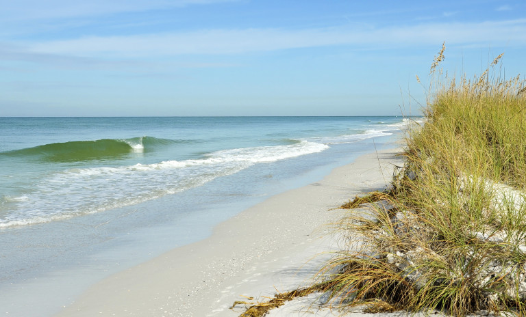
Our first step was to tell the story of Longboat Key and design a look and feel that showcased the elements that make it unique: its breathtaking natural beauty from ocean to bay, beaches to mangroves; a luxurious but relaxed vibe; and the opportunity to enjoy world-class accommodations, dining, shopping, golf, fishing, and boating all just a Vespa-ride away. We began with the identity and took the “LbK” letters and immersed them in waves, sand, and sun. We chose a bold and playful, yet refined and elegant font and palette. Then we merged the Chamber and the Longboat Key story into the tagline – “Work or play, its a beautiful day!” which seemed to capture the message of both business and travel sides of the chamber.
As we were developing the identity, we were simultaneously sketching out all the components for the brand to ensure everything worked together as one cohesive unit: website, advertising, print collateral, and merchandising. The website posed the biggest challenge not only in making it beautiful enough to reflect LbK itself, but by offering a host of unique functions that would set it apart from other chamber sites, all wrapped in a simple, intuitive, easy-to-navigate, and quick-loading interface.
From the moment the visitor arrives on the landing page for both sides of the Chamber and Visitor Information website, they are given only a few choices at a time, which keeps pages uncluttered and makes navigation speedy. Chamber members can go directly to their side of the site and easily find calendar listings, do a search for other members, or sign-up for an event. They can also choose to enhance their basic listing by adding options such as a logo, map, video, or special offers. And all advertisers now have the opportunity to see their ad at the top of the page, as the ads shuffle and re-load with every page refresh or new visit, so no one can “buy” their way to the top. Visitors interested in exploring Longboat Key as a vacation destination can actually plan their stay from the LbK Visitor Information site. With one click from the landing page, they are welcomed to paradise and offered options to learn about upcoming events, search accommodations or activities, make reservations, even look for real estate to make paradise their home.
Although the bulk of the site was completed and launched on July 1st, over the next few months Chamber members will continue to upload their information for their new listings, and we will be working with them to create new ads, tweak the function to be even more streamlined, developing merchandising from golf hats to beach bags, and preparing print collateral and signage for events.
A special thanks goes out to the leader and support team of the “revolution”, Tom and Dawn. Throughout the entire project they were instrumental in generating ideas, refining functionality, approving layouts, looking out for and anticipating the needs of every member and visitor to the Chamber. They made themselves available at all hours and on weekends to answer questions and provide information to make our work easier which kept the project moving forward and brought it in on-time.

