As a corporate partner to South Florida Museum, we regularly work with Museum staff and volunteers to design displays, advertising, banners, invitations, posters, and print collateral. Recently we were asked to brand their 2014 Capital Campaign with an identity and tagline, and create digital and print collateral including a brochure, newsletter, and powerpoint presentation that would engage and educate potential donors about the possibilities of future expansion.
As a kick-off to the campaign, we met with a group of Museum staff, corporate partners, and professional non-profit advisors for a day-long brainstorming session to generate ideas for the campaign theme. We went away with many concepts and buzzwords to pursue, and followed up with our own in-house creative sessions to pin down an approach. After weeks of sketching and follow-up calls with Museum staff to discuss our ideas, we came up with a solution that crystallized the overall concept of the campaign: the word “Connect” paired with a tree built from many interconnected pathways. This one image captured the main ideas of: growth of the Museum in structure, available amenities, and new members and donors; pathways that are being developed within the museum and with the community at large; and connection between staff, volunteers, visitors, and potential donors in helping to build and support the Museum over the next 50 years and beyond. The tagline simply states what the tree represents, “Creating Pathways”.
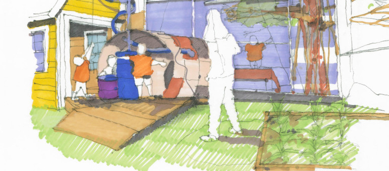
After a few tweaks, the branding, new campaign logo, and tagline were accepted, and we began to design the marketing communications and support materials. One of our primary objectives at Boost Studio are to ensure that a brand and all its components work together as a whole. To that end, we found ways of using the tree and sections of the pathways of the tree to represent various aspects of the campaign, such as new spaces or new experiences, and color-coded them with friendly, bright colors. Then we used these paths as a graphic element to visually identify each area in the brochure, newsletter, and powerpoint presentation. We created a folder that holds the brochure, letter of introduction, business card, and CD as a hand-out for potential donors, along with merchandising to build awareness and connection with everyone involved with the campaign.
The end result is a visually engaging, cohesive campaign that is approachable, easy-to-understand, and demonstrates the campaign spirit of connection in the brand and in all its components.
AWARDS
• 2 American Advertising Federation ADDY Awards

