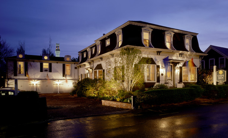
Carpe Diem is an extraordinary boutique guesthouse in Provincetown, Ma. Carpe’s former identity, website, and collateral was inconsistent, confusing, and uninspired. Moreover, it did not capture the distinctive personality of this Euro-Asian influenced gem.
We began the carpe re-brand with the identity, the cornerstone of a brand’s re-design. We selected a serif font with subtle curves and a palette of gold, black and white to reflect the inn’s regal ambience and euro-asian influences. Also, we used a mirror-image to create an identity for the on-site spa to work in harmony with the Inn’s mark, yet remain distinctive. Once we established a new identity, we infused the site’s look and feel with the Euro-Asian elements of the new brand. We replaced the heavy blue and white colors, small photos, confusing navigation, and minimal content with the brand’s new logo and striking color palette, a large photo window, a curved and easy-to-use nav bar and rewrote the content.
We brought all the elements together to convey luxury, comfort, and quality in one cohesive brand. The site now showcases the true essence of this world-class Inn, and it has been fully booked since the brand launch.

