Brand personality
At the start of every project, we develop a custom color palette as part of the brand identity. Just as we select typefaces that establish the brand’s look and feel, we also use colors to express its unique “personality”.
Color match
Color is a powerful tool that can cause a physical reaction or set a mood. For example, red makes us hungry and passionate; Blue is calming and establishes trust; Green says fresh and natural. If we are selecting colors for a financial firm, such as the 8558 group, we may choose blue/black/gray because they say “serious, confident, trustworthy”. Or for travel, like the Longboat Key Chamber visitor website, we used colors that reflect the environment and attitude: sun/sand, mangroves/palm trees, and water/sky. The palette should always match the elements and aspects of the brand’s personality.
Art and science
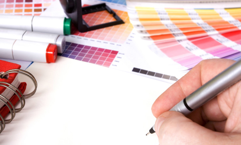
Choosing colors is part science, part art: science can be explained, art must be experienced. We set about defining a palette by looking at photos, swatches, and color guides, asking questions and sharing emotional reactions: Will warm, cool, or a combination create the proper response? Is the color saturated enough to use for text? Do we have enough variety for all applications? Have we found something sedate and one with pop? How does the color overlap a photo, or reverse-out of black? When we get close to the right mix, we place color chips together and create several palettes to give us options as we combine type and image in our layouts.
Brand palette
Colors remain in flux until we are satisfied that the palette has the strength and flexibility to work with every application. The palette is then added to the “Brand Guide”, a book we create for every brand containing specifications for brand usage, to ensure that all components will be cohesive throughout the brand.

