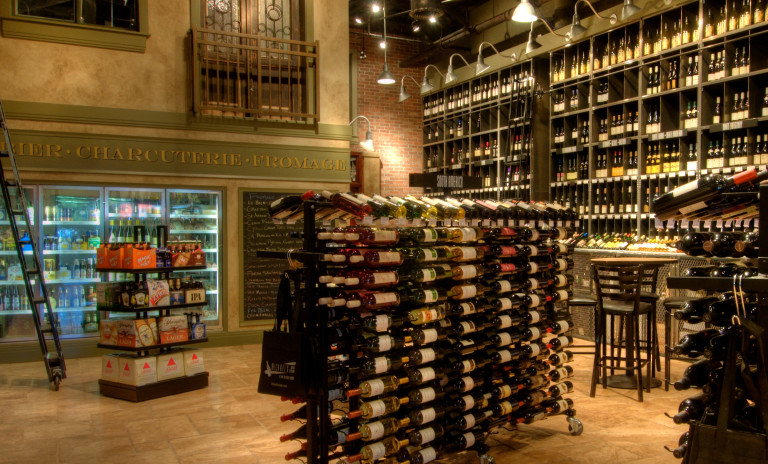
Michael’s On East is celebrating 25 years as the premier choice for dining, catering, and international wine sales in Sarasota Fl. To mark the occasion, Michael’s wanted to reinvent themselves with a fresh look that would attract new clients who may not have discovered all that Michael’s has to offer but still speak to the loyal guests who consider Michael’s to be “their” special place. To increase visibility and marketing ROI, all the divisions of restaurant, catering/ballroom, wine cellar, and online store must be brought together under one brand.
Michael’s 3 identities had to capture the artful approach to their inspired cuisine, along with the luxurious ambience of the restaurant, the hip vibe of the wine cellar, and the european feel of the ballroom and terrace. Each identity must be instantly recognizable and distinctive yet work together as one brand family. With overlapping graceful curves forming a capital “M”, and the use of vibrant, gem-like colors for each division of the Michael’s brand, we created a contemporary “work of art” as a mark. Then to bring a touch of the old with the new, we chose a bold, art-deco-inspired typeface for the name that would be easy to read on everything from street signs to advertising and menus.
The new brand reflects the artistry and sophistication of Michael’s cuisine and venues: visually striking, luxurious and contemporary, appealing to a variety of generations and tastes. The 3 identities have their own distinctive palette yet work together cohesively in one brand family. Since the launch, public feedback has been overwhelmingly positive creating a lot of “buzz” for the brand, increasing visibility, and giving Michael’s image a boost.
AWARDS
• 1 American Advertising Federation ADDY Award

